
Compelling the need for earthquake insurance
Shake and Pay® is an insurance company specializing in offering a first dollar, no deductible earthquake insurance.
With an outdated and underperforming website, they approached us to rethink their online strategy and set the stage for the future.
With an outdated and underperforming website, they approached us to rethink their online strategy and set the stage for the future.
My role
UX/UI Designer
Timeframe
4 weeks
.svg)
.png)
Modernising with knowledge and community.
We set out to create a compelling digital presence to realize their vision and help educate for the need to protect commercial and residential equity with Shake and Pay® earthquake insurance.
Empathize
Educating because the User doesn’t know what they don’t know.
In speaking with homeowners, those that lived in earthquake prone areas or not- we found that most owners and rentals even while owning a home insurance- didn’t actually know what their insurance policy included coverage on. Most didn’t realize they weren’t already covered for Earthquake insurance.
An affinity map further broke down the conversations into buckets of user behaviors, business goals, earthquake insurance pricing, coverage policies, claims procedures, and from there continued branching further into comparision of a traditional insurance policy versus Why Shake and Pay®?
An affinity map further broke down the conversations into buckets of user behaviors, business goals, earthquake insurance pricing, coverage policies, claims procedures, and from there continued branching further into comparision of a traditional insurance policy versus Why Shake and Pay®?
%201.png)
Define
Storytelling a compelling journey
A site map with content strategy storytells Shake and Pay’s value propositions, framed by focused user journeys driving to a quote generator, and user questions answered by a personable chatbot named Annie. With the key points reflected from the user research taking centre stage:
- Here's what traditional insurance costs
- Here's what S&P costs
- Here's our policy
- Here’s what you’ll get from S&P
%201.png)
Building the framework to drive persuasion.
With our north star set, wireframes were layed out to educate users to understand the need for Earthquake Insurance. We wanted to make sure the users not only understood the Why’s but also the How’s. How to see if they are covered, How to file a claim.
Navigation of the website’s information-rich sections are in themed pages — such as the Coverage, Claims and FAQs pages with a running thread through them all of Why Shake and Pay — aiming to communicate a stronger, more direct message for deeper audience engagement.
Navigation of the website’s information-rich sections are in themed pages — such as the Coverage, Claims and FAQs pages with a running thread through them all of Why Shake and Pay — aiming to communicate a stronger, more direct message for deeper audience engagement.
Ideate
.png)
Design components and icons to visualize a story.
To convey the warmth and compassion of Shake and Pay® and to build trust and transparency, we put together a pallete of sophisticated and calming colors of blues, greens and grey and cream nuetrals. We drew design inspiration from illustrations and animations, to storytell the how-to’s in the aftermath of an earthquake with flat vector artwork and infographics.
Design
.png)
To put an empathisis on the danger of earthquakes, we added a cautionary orange red color to represent the friendly neighborhood Earthquake insurance expert, Annie. Annie was a personality dreamed up by our strategy team to add a human voice to Shake and Pay®. On the hi-fidelity wireframes, we imagined her leaving handwritten conversational and friendly notes over more legal and technical jargon in addition to being the voice of the chatbot.
%201.png)
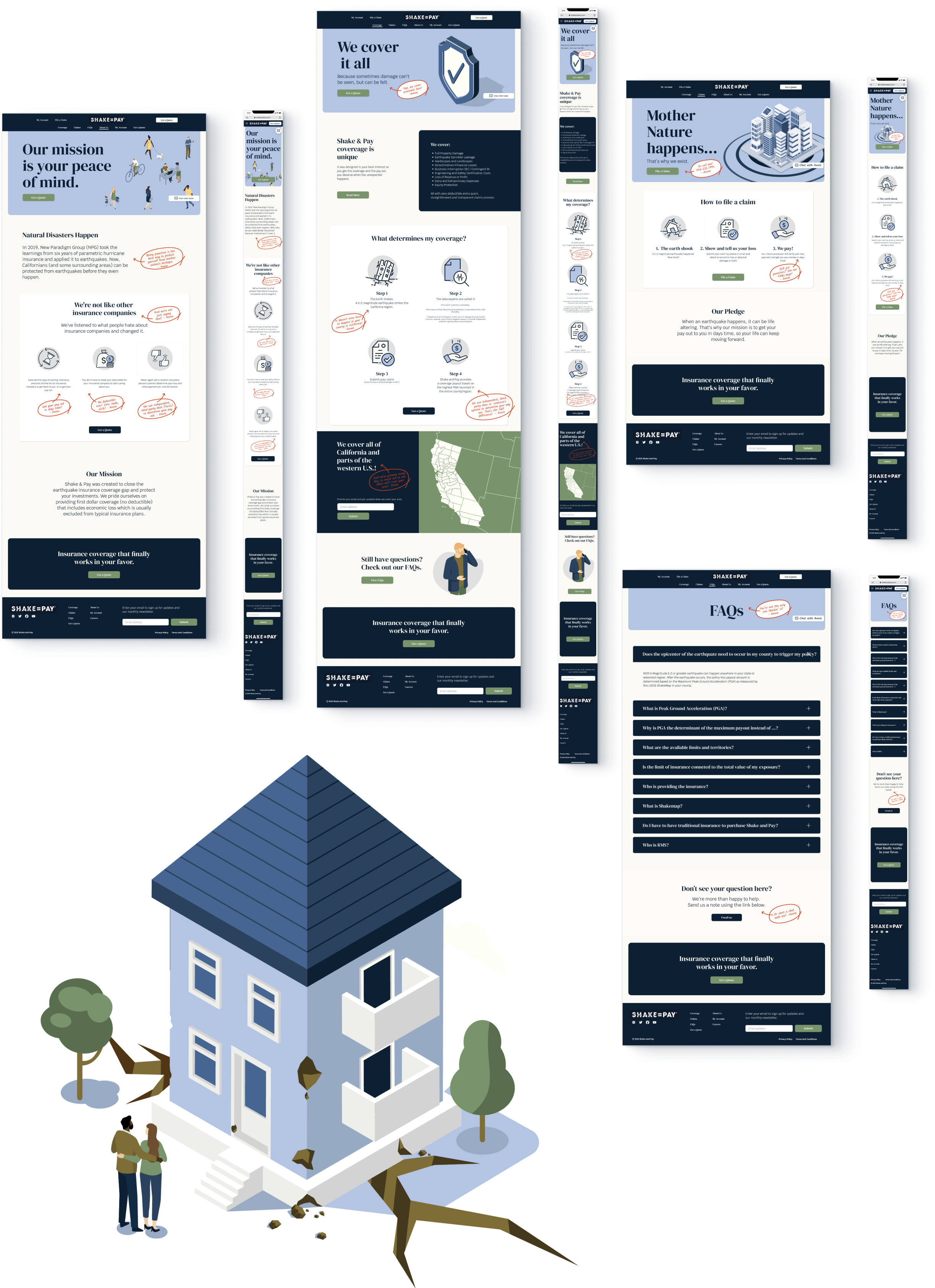
A convenient, educational
experience for every customer
experience for every customer
Page layouts and navigation are optimised for all screen sizes to allow users to engage with the information and business on their own terms.
.png)
A convenient, educational experience for every customer
Page layouts and navigation are optimised for all screen sizes to allow users to engage with the information and business on their own terms.
Advocating for a need of equity protection
The new Shake and Pay ® website would deliver a educational contemporary customer experience and a more powerful and seamless flow to conversion.
%20(5).png)
Back Top

© 2026 LauraLau.Design